Designing Label Templates –Why You Should Design From The Background Forward
Why we recommend building up label designs from the background forwards.
Take Control Of Layered Designs In Word Label Templates
Word doesn’t always place nice when it comes to positioning elements together. It is especially troublesome if you need to accurately position and/or layer different types of elements. Word always prioritises text, which means images are often relegated to the background or just out of the way of the text Word assumes you want to enter.
Word label templates are also basically a table that you fill with your design. While you don’t print the template itself, Word will still treat the table as a layer. Given that a table COULD contain text, Word might move your template in front of the images you want to use in your design.
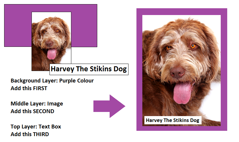
This is why we recommend building layered designs from the background up.

The table should be the absolute background layer of your template. First, add the background layer of your design. Once you’re happy that it’s in the correct position (and layered above your table), add the next layer forward. Once you’re happy with this layer, move on to the next layer forward, and so on, until your design is complete.
Working from the background forward makes the process of building up layered designs much simpler. It helps to prevent problems with your template shifting forward (causing elements in your design to disappear behind your template) and means you don’t have to spend time trying to switch between layers and moving elements backwards and forwards to get your required design.
 Label Planet