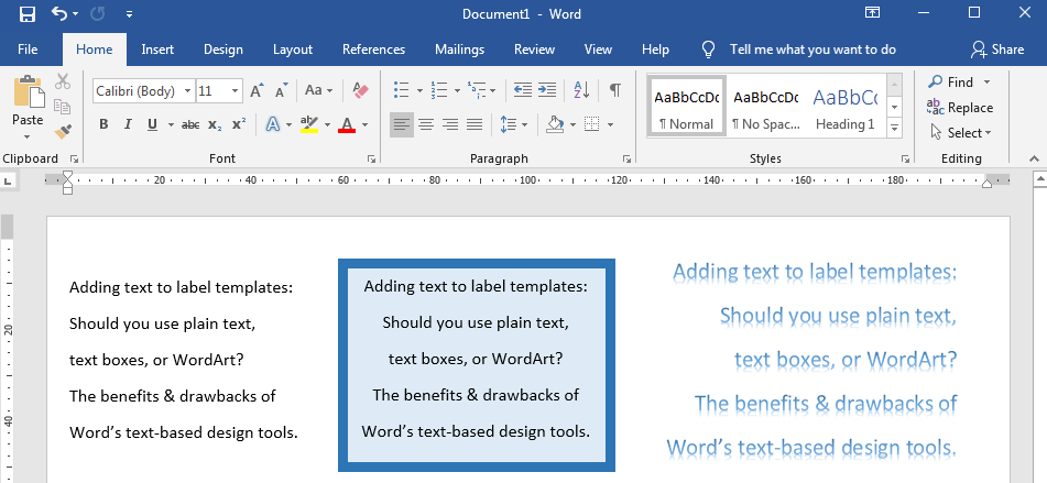
Our guide to the benefits and drawbacks of Word's text-based design tools.

Basic Text In Label Templates – The Benefits & Drawbacks
Basic text is both the easiest and quickest way to add text into label templates but also the most basic. While you can add your text simply by clicking inside a label and typing (or even pasting in text from an external source), you will be limited in the formatting options available.
While you can quite easily change the colour, size, and emphasis of your text, you won’t be able to apply more sophisticated styles and effects.
You’ll also find that you have less control over the positioning of your text. While you can select an alignment and choose a Wrap Text formatting option that gives you greater control over the positioning of your text (we recommend “Tight” or “In Front Of Text” as a backup), basic text will always be more unruly than text that is contained within a single object (like a text box or WordArt). You’ll also struggle to use basic text in a layered design; if your design contains a mixture of background, border, text, and image elements, you need to be able to control the position of each element and layer them as needed to create your finished design. Basic text in a Word label template is not easily layered.
Text Boxes & WordArt – The Benefits & Drawbacks
Text boxes and WordArt give you access to the more sophisticated formatting tools available in Word label templates. This means that you can apply more sophisticated styles and effects to your text (great if you want a bright, eye-catching design) and gives you far greater control over the positioning and arrangement of your text. This is because your text is contained within a single object, which can be moved and resized quickly and easily compared to basic text, which is automatically arranged into straight lines across the page. It also means you can layer your text boxes and WordArt to create more intricate designs.
NB: you’ll need to change the default “Wrap Text” option to give yourself more control over the positioning of these objects. We recommend using “Tight” – with “In Front Of Text” as an alternative if you need it. You’ll also need to take care with the background of text boxes – the default format is a solid white background with a black border, which you will need to change to a transparent background (no fill) and no border (no outline) if that text box needs to sit above another layer without blocking it out.
The main drawback of text boxes and WordArt is that you will need to spend extra time getting the sizing, positioning, alignment, arrangement, and formatting just right in order to achieve your required design. If you don’t need your labels to be especially decorative, you should consider sticking with basic text to get your label template set up much faster.
Which Text Is Best – Basic Text VS Text Boxes & WordArt
In the end, it really comes down to how complicated your label design needs to be; for very simple text-based designs, such as address labels, basic text is a quick and simple way to get your content added and your labels printed. If you want a more sophisticated graphic design, especially one that relies on combining / layering text and images together within one design, then adding your text within an object such as a text box or WordArt will give you much greater control over the positioning and arrangement of your text – making it much, much easier to create your required design.
 Label Planet