Designing Label Templates – How (& Why) You Should Ensure Your Design Walks The Line At The Edges Of Your Labels
Reasons why you should take care with label designs that fill your self adhesive labels.
Printing label templates can be a tricky business at the best of times – but it becomes especially difficult when label designs sit very close to or at the edges of each label. Here’s our guide to how (and why) you should take care with label designs that fill your self adhesive labels.
Why You Need To Be Careful With Label Templates That Include Label Designs At The Edges Of Your Labels
Basically, label designs that sit at the edges of your labels require a LOT more accuracy to print properly, compared to label designs that don’t touch the edges.
This is because a misalignment at the edges of your labels is much more obvious than a misalignment in the middle of your labels. For example, a misaligned border is always more obvious than a misaligned design in the middle of a label.
The one exception is designs that mirror the shape of your labels – for example, the misalignment of a round logo that is supposed to be centred in a round label will be more obvious than a round logo misaligned in a rectangular label.
Essentially, if your design doesn’t sit at or mirror the edges of your labels, there is some wiggle room with how accurately aligned your design needs to be to produce a label that is visually acceptable.
Designs that follow the edges of your labels require extra precision when printing to ensure that each design lines up perfectly with each label.
Furthermore, you also need to consider problems that can occur with label layouts where some (or all) of your labels are butt cut – i.e. one or more of the sides of each label touches another label. If your design sits at the very edges of your labels – and is very slightly misaligned during the printing process – you may find that your designs end up overlapping onto other labels.
Given that most software and printers are limited in how accurately they can position print, however, it can be difficult to get every design aligned perfectly on every label. So what can you do? We’ve got a few suggestions to help you design and print label templates that keep your designs in line with your labels.
How To Make Sure Your Label Designs Walk The Line Of The Edges Of Your Labels In Label Templates
There are a number of ways to make it easier to ensure that your designs end up perfectly aligned on your labels when you need or want to make use of the very edges of your labels. The method you choose will depend on the layout of your labels and the kind of design you want to achieve.

Adapt Your Design So It Doesn’t Use The Edges / Shaping Of Your Labels
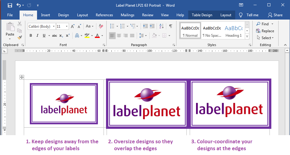
The easiest option is to avoid adding any design elements at the edges of your labels (and avoiding designs that mirror the shape of your labels). This is easiest with rectangular labels, which don’t have the more obvious shaping of round labels, oval labels, or square labels.
Simply make sure you don’t have a coloured border or background at the edges of your labels and you’ll give yourself a little wiggle room with how precisely you need to align your designs.
Oversize Your Design So It Overlaps The Edges Of Your Labels
If you do want or need to use a design that makes use of the edges / shaping of your labels, the best way to avoid misalignment issues is to oversize your border / coloured background so that it overlaps the edges of your labels – all the way around each label. We recommend making borders as thick as you can (within the confines of your design obviously) and then oversizing borders/backgrounds by a few mm.
This prevents a printing defect called white edging from occurring; if there is a slight misalignment of your design on a label, part of the label will be left unprinted. As most labels are white, the unprinted area remains white – hence white edging.
Overlapping your design minimises the effect of any slight misalignment – again creating wiggle room with how accurate you need to be with your printing.
Keep Your Design Colour-Coordinated At The Edges Of Your Labels
The one problem with oversizing designs is that your designs might end up overlapping onto other labels. The way to avoid this problem is to follow our first tip (adapting your design so that it doesn’t sit at the edges of your labels) or to make sure that your design colour matches the edges of other labels. For example, if you add a border that is a single colour (e.g. purple) all the way around your labels, where it overlaps onto another label, the overlap will be of the same colour – meaning you won’t be able to tell that the overlap is there at all!
 Label Planet